
Above is the first design that I have come up with for my advert. It adopts the same overflowing barrel motif, which is further simplified (purely because it was too hard to get the same realistic dripping rippling water effect that I created for the digipak, below:)

Otherwise, the overflowing barrel design remains much the same. The fonts, colours and minimalism is seen across both products. The green which is seen on both promotional packages is a homage to my music video, which is partially set in a forest.
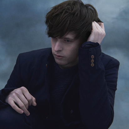
Key differences may include my use of the grey - blue gradient in the last third of the page. Its something that wasn't really present in my digipak - there were uses of gradients but never as a backdrop. Here I am trying to draw on James Blake's iconic use of cold light and blue in his own videos and promotional work.

Here, I have incorporated the same design ideas that made my digipak inside artwork so stark. The shapes and the way their shadows starkly form against the canvas is effective in making the advert more noticeable when scrolling through a magazine.
But this was an area where I want to make use of social media. I will ask twenty friends across twitter, messaging applications and Facebook for their thoughts on which design is better.
No comments:
Post a Comment