Once you know what theme you're going for in your digipak design - which is usually established by the front cover, the rest is a little easier.
Friday, 19 December 2014
Digipak front cover design... continued
With the basic guidance of my step-father, I was able to create a template for my digipak album design using 'Adobe InDesign'. I was trying to create a more professional design by using more professional software than pixelmator or a microsoft office program, or... heaven forbid - paint.
Thursday, 18 December 2014
Nirvana - Come As You Are analysis PART 2
The video is filled with many abstract shots, which don't really make sense or form any kind of narrative when taken plainly. You need to actively choose to look more in depth at the imagery to decipher possible meanings - and even then, there are many different possible routes you can take to deciding what the video means. There is also a lot of performance in the video. It was something that Nirvana was perhaps known for in periods of his career, something that carried over to his videos - something that is synonymous with the rock genre in music videos.
At the beginning of the video, there is a gun floating in the water, sinking. This denotes that the gun has been discarded, and is now possibly unusable. The obvious connotation to take from the shots would be that the singer/ character singing in the video is forgiving towards someone who has wronged him, and is willing to throw away his anger (the gun), and this would also match with the lyrics towards the end of the song 'No I don't have a gun'. However, I would analyse this to be a ruse. There is too much hesitation and contradicting lines in the lyrics of the song to take the shot at face value.
I would take a view that the gun floating in the water is to lure the one who has wronged - back to a vulnerable position for possible revenge. Nonetheless, the gun is important in holding the interests of an audience - such a violent prop in the mise-en-scene raises interests for what exactly its purpose is - usually it is to kill.
Later in the video, there is shown a dog limping with a neck collar brace on. As I mentioned before, there are so many different possible readings you can take from the video. Mine is that the dog symbolises the pain and hurt that has been caused to the singer. If you take this connotation, it leads you to believe there isn't much reason for the singer to forgive the one who wronged him in the past, as he has still kept hold of the injury. Dogs - like other animals, are also held to importance by many families in the western world who keep them as pets. Seeing a possibly distressed dog is upsetting and raises a stir among many audiences, which might have the effect of intriguing them to see what else happens in the video.
It is by this point that you start to notice that most transitions are via cross fades rather than fast paced short cuts. This matches with the (at times) slow tempo of the song to make it aesthetically pleasing and conventionally consistent in its pacing. Slow pacing is also less excitable and often allows more time for reflection on what is happening.
Several times in the video, you see the quite frantic mise-en-scene of Kurt Cobain holding/ dangling onto a chandelier as it rocks across a hall. Such eccentric imagery can appear to be quite menacing and frightening if you compare them to the often welcoming lyrics. You could say that the swinging on the chandelier connotes that the singer is not mentally stable or as welcoming and calm as some of the lyrics make him out to be. This would interest audiences as they would want to find out what his intentions are, or whether he does anything else that they would consider to be frantic within the video.
There are quite a few close-ups on a twitching eye in the video, looking up, down, side to side - in quite a hysterical manner. This reinforces my previous point in denoting that there is something off about the sincerity and calmness of the lyrics in the video. The representations in the video aren't welcoming, indeed they're actually quite agitated, wild and panicky. This could have been done in the video in the hope of grabbing the audience's attention as to why it is so anxious. Perhaps this would lead to audiences analysing the video and song in more depth than they had previously intended to.
Once again adding to the notion that there is a lack of transparency, there are several scenes where a small waterfall is used in front of band members' faces, blurring and concealing their features to some extent. This, mixed with the low key lighting to create darkness and awkward top lighting, makes it very hard to get a picture of what is actually going on besides band members playing instruments. The sharp It makes you 1.) focus on what is happening to a greater extent in the hope of uncovering a mise-en-scene, and 2.) wonder if the person being sung to is being tricked into a false sense of security, as the band members aren't being completely transparent or visible as they sing to you. It makes you untrusting, particularly when the music playing has just gotten sharper, louder and more violent as a guitar solo starts and Kurt sings 'I don't have a gun'. Oh don't you?
There are a few particular scenes, one used as Nirvana's album cover in fact, which seem out of place with my idea and outlook so far in the video. One of these scenes is a low angle shot of a baby swimming through a, appearing to swim after a dollar as it is pulled along the surface. The origin of this is Kurt Cobain's belief that we are taught to chase after money the day that we are born. It's hard to fit that belief into my theory so far on the song and video, or into the video in a way which really matches anything else at all.
One idea I have is that the baby represents the person the singer is talking to. The baby is helpless as it is tricked by the dollar on a hook, swimming after it as if swimming into a trap. What it does do, is match the quirky attitude of the music video. Maybe it was just put in because it looked good and Cobain liked the 'chase after money' idea, and has no other relation to the rest of the video.
The other scenes are the ones which have biology imagery. (Are these called extreme extreme extreme close ups?) They look at cells as they multiple at an incredible rate, and another at a living organism in its embryotic stages. Other than the connection that it makes for a frantic and out of control mise-en-scene, I can't make a connection to the video. Scenes like these are ones that I hope to avoid in my own music video.
Things can be abstract and things can be deeper than face value, but I don't want anything to be unexplainable to the average audience member.
Wednesday, 17 December 2014
Production update 4
Yep. I decided I needed yet more footage.
Yesterday I filmed what I sincerely hope and believe to be my final batch of clips. I had to creatively capture the footage in a way I hadn't really acknowledged before, by introducing 'selfie' handheld shots. I learned that this allowed me to capture the intensity of an argument in a way which makes the audience feel like they are in the scene rather than watching it from afar. It was a much more personal experience than if I had filmed it in any other way.
It did limit me in what kinds of shots and scenes I could compellingly produce - but I was happy with the ones I did.
Tuesday, 16 December 2014
Ideas for final edit update
Happy as I am with my current edit - The more I look at my music video the more I feel as though there are cuts which are a little too warm and bright in colour temperature. Over the next few days I am going to look for ways that I can solve this problem, as it leaves the video feeling a little too inconsistent in the few areas that this happens for.
One of my ideas is to use a black and white filter over footage which looks jarring, but if the problem persists - or the black and white doesn't really go - I could go towards editing far more than first intended and removing and adding or modifying footage.
Imagery on digipak covers
In hindsight, I probably should made this post first - before the typography research. So many decisions that are made on typography are heavily influenced by the choice of images on the rest of the album cover/ digipak design.
This is because while still important, typography/ type design is most of the time a second consideration after the rest of the design (although badly designed typography could ruin a cover). The text isn't usually the first thing people see, or a particularly marketable element when compared to the imagery on the cover.
Due to all of the different genres out there as well as artists desperately wanting to stand out, there are thousands of possibilities for digipak cover imagery.
Just take a look at David Bowie - a major figure in world music for over four decades. His digipak cover is below - an assortment of abstract images and blotches of colour, and a much younger and cartoon-like re imagining of Bowie himself.

From using media analysis but having not listened to the album myself, I would guess that the contrast of the name of the album 'reality' to the abstract representations on the cover either suggests a rejection of reality in favour of a hyper-reality world, or an accepting of reality and discarding of unrealistic ideas and thoughts. I lean towards the former.
But someone who doesn't particularly care about the connotations of a digipak cover is more interested in whether the product looks good or not. While subjective to some extent, most would agree that the bright and bold colours of Bowie's digipak cover is successful in drawing good attention.
So, sometimes your digipak cover can have meanings - but this doesn't mean much if the cover doesn't look great too. With that said - here are some of the biggest points I have learned when researching digipak imagery:
1.) Research your brand and keep relatively consistent to it:
James Blake is an artist who deals with electric pop and house music - but he goes about it in a very unconventional way. This allows me to have a lot of creative freedom in what I put in my cover, but not too much. It still wouldn't make sense if I pushed a death metal style cover in.
Instead, stay consistent to a slow, thoughtful and somewhat understated design that is used in a lot of James Blake's work. He uses a lot of dark colours in his work - so it makes sense to use darker colours than David Bowie, for example, who's dynamic range of music and style allows him to use just about any colours he wants.
You can see James Blake's brand of music philosophy in his own album cover below:

Firstly, muted, dark colours are used. And a colder, blue theme is preferred over a reddish one. This stays consistent with the slow and dark nature of his music.
2.) If you want something to stand out, big doesn't always work.
Sure, making something large can draw attention to it, but it's not always the best way. One thing that is encouraged in digital design is the use of space and contrast over size. If you leave a lot of empty space around a particular item, it stands out. If you use particular contrast, it helps the contrasting item to stand out.
3.) Digipak covers very often use a mixture of abstract and real imagery.
In a world where a large majority in most cultures own a pocketable camera in the form of phones, and globalisation through social media and the internet has led to the sharing of fantastic photography across all corners of the population. As a result, it perhaps becomes more difficult to create photographs which show something new and interesting to audiences in the small format of a digipak cover. I theorise that this leads to artists combining abstract imagery with realistic imagery to create more interesting covers. You can see this at work in James Blake's album cover, as well as Christina Aguilera's cover below.

If the image consisted of only Aguilera's real face, it wouldn't really be interesting enough to engage audiences beyond Aguilera's brand name. The abstract bionic imagery adds a new dimension to the piece, making it more enticing and proposing a deeper message - perhaps the album has an electronic style? Maybe it's a comment on society?
Conclusion:
You could argue about what is most important when it comes to designing cover art. Is it the message of the album? Is it pure aesthetics? A representation of the album's style? I like to think that they are - most of the time, considered of equal importance. I would say that the process is first: How do we represent the style of the music on our cover. Second: How can we make a possible message out of the elements that we've picked up on so far? And lastly: How can we make this work aesthetically.
Due to all of the different genres out there as well as artists desperately wanting to stand out, there are thousands of possibilities for digipak cover imagery.
Just take a look at David Bowie - a major figure in world music for over four decades. His digipak cover is below - an assortment of abstract images and blotches of colour, and a much younger and cartoon-like re imagining of Bowie himself.

From using media analysis but having not listened to the album myself, I would guess that the contrast of the name of the album 'reality' to the abstract representations on the cover either suggests a rejection of reality in favour of a hyper-reality world, or an accepting of reality and discarding of unrealistic ideas and thoughts. I lean towards the former.
But someone who doesn't particularly care about the connotations of a digipak cover is more interested in whether the product looks good or not. While subjective to some extent, most would agree that the bright and bold colours of Bowie's digipak cover is successful in drawing good attention.
So, sometimes your digipak cover can have meanings - but this doesn't mean much if the cover doesn't look great too. With that said - here are some of the biggest points I have learned when researching digipak imagery:
1.) Research your brand and keep relatively consistent to it:
James Blake is an artist who deals with electric pop and house music - but he goes about it in a very unconventional way. This allows me to have a lot of creative freedom in what I put in my cover, but not too much. It still wouldn't make sense if I pushed a death metal style cover in.
Instead, stay consistent to a slow, thoughtful and somewhat understated design that is used in a lot of James Blake's work. He uses a lot of dark colours in his work - so it makes sense to use darker colours than David Bowie, for example, who's dynamic range of music and style allows him to use just about any colours he wants.
You can see James Blake's brand of music philosophy in his own album cover below:
Firstly, muted, dark colours are used. And a colder, blue theme is preferred over a reddish one. This stays consistent with the slow and dark nature of his music.
2.) If you want something to stand out, big doesn't always work.
Sure, making something large can draw attention to it, but it's not always the best way. One thing that is encouraged in digital design is the use of space and contrast over size. If you leave a lot of empty space around a particular item, it stands out. If you use particular contrast, it helps the contrasting item to stand out.
3.) Digipak covers very often use a mixture of abstract and real imagery.
In a world where a large majority in most cultures own a pocketable camera in the form of phones, and globalisation through social media and the internet has led to the sharing of fantastic photography across all corners of the population. As a result, it perhaps becomes more difficult to create photographs which show something new and interesting to audiences in the small format of a digipak cover. I theorise that this leads to artists combining abstract imagery with realistic imagery to create more interesting covers. You can see this at work in James Blake's album cover, as well as Christina Aguilera's cover below.
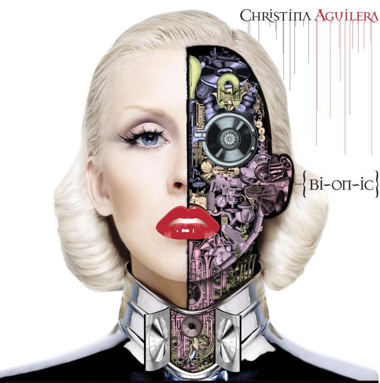
If the image consisted of only Aguilera's real face, it wouldn't really be interesting enough to engage audiences beyond Aguilera's brand name. The abstract bionic imagery adds a new dimension to the piece, making it more enticing and proposing a deeper message - perhaps the album has an electronic style? Maybe it's a comment on society?
Conclusion:
You could argue about what is most important when it comes to designing cover art. Is it the message of the album? Is it pure aesthetics? A representation of the album's style? I like to think that they are - most of the time, considered of equal importance. I would say that the process is first: How do we represent the style of the music on our cover. Second: How can we make a possible message out of the elements that we've picked up on so far? And lastly: How can we make this work aesthetically.
Thursday, 11 December 2014
Editing update 4

My product is most likely completely finished at this point. I took on board my teacher's advice to remove audio from the hallway argument scene, and I tried to introduce more still shots towards the end of my piece, when the song is settling down. I chose to fade out the song very gradually, much as it is done in other professional productions. There is no more footage needing to be filmed, and I am fairly confident in my product at this point.
Design for digipak 2
Now that I had edited my core - front cover photograph, I have to think about how I am going to fit it into a digipak format. Below are some of the designs I have come up with for my front cover.


I decided I would have to cut off the woodland on the left side of the path, and the skull side of the actress' face. It was important to show that the album is a 'journey' hence why I kept the path in - while I can still make use of the skull side of the face in other parts of the design. Having a photograph in which the actress looks directly at the camera reinforces an idea of it being a performance, and that she is looking at you - the customer.
I chose to make use of the space on the cover by using large spacing between letters, so that the title is more readable from further away (in stores, customers will be walking quickly through the isles, they might not look more than once at the covers). I chose to position the artist name halfway between where the actress' face starts - this was to make sure there wasn't too much symmetricality in the cover, so that it stood out while not looking out of place.
To follow my music video's theme further, I used two font colours - one white and one a darker grey. This follows the skull half of face idea of my production. This also uses my research on readability, all capitals with enough space in-between. The font I used was _____ and i made sure to keep it in all upper case, so to preserve consistency and boldness.

In my second attempt, I think I improved the design a lot. The changing of the album title to the bottom of the cover means that customers have space to rest their eyes and are able to more easily understand what is happening in the photograph (before, text was dashing across the middle.
I decided that my positioning of text had gotten to the point where it was perfect, but I still wanted to find ways to improve my cover. I tried to test out some of the other photograph edits to see if they would be more aesthetically pleasing or bold than my current one. I also wanted to see if there could be any improvements to the choice of font, even though I was happy with it already.


The cross-fade effect in the photo is great at introducing the connotations of it being a deeper and abstract album, which really makes it stand out more as the cover for a unusual genre. This will be my front cover, pending any further updates.
Seeing as though a digipak cover is much squarer, there was a lot I had to cut out from my original picture, below:
I decided I would have to cut off the woodland on the left side of the path, and the skull side of the actress' face. It was important to show that the album is a 'journey' hence why I kept the path in - while I can still make use of the skull side of the face in other parts of the design. Having a photograph in which the actress looks directly at the camera reinforces an idea of it being a performance, and that she is looking at you - the customer.
I chose to make use of the space on the cover by using large spacing between letters, so that the title is more readable from further away (in stores, customers will be walking quickly through the isles, they might not look more than once at the covers). I chose to position the artist name halfway between where the actress' face starts - this was to make sure there wasn't too much symmetricality in the cover, so that it stood out while not looking out of place.
To follow my music video's theme further, I used two font colours - one white and one a darker grey. This follows the skull half of face idea of my production. This also uses my research on readability, all capitals with enough space in-between. The font I used was _____ and i made sure to keep it in all upper case, so to preserve consistency and boldness.
In my second attempt, I think I improved the design a lot. The changing of the album title to the bottom of the cover means that customers have space to rest their eyes and are able to more easily understand what is happening in the photograph (before, text was dashing across the middle.
I decided that my positioning of text had gotten to the point where it was perfect, but I still wanted to find ways to improve my cover. I tried to test out some of the other photograph edits to see if they would be more aesthetically pleasing or bold than my current one. I also wanted to see if there could be any improvements to the choice of font, even though I was happy with it already.
I chose to use my brighter but more neutrally saturated edit. The brighter cover with greener-greens would stand out more than my previous attempt. The harsher colours also connote a darker, more reflective album, which James Blake's music usually is.
But again, there isn't really enough different about the album to distinguish itself for anything else or necessarily to establish James Blake's unusual genre of music. I decided to take inspiration from his actual album cover:
And so I came up with:
The cross-fade effect in the photo is great at introducing the connotations of it being a deeper and abstract album, which really makes it stand out more as the cover for a unusual genre. This will be my front cover, pending any further updates.
Monday, 8 December 2014
Production update 3
Having decided I'm in (quite dire) need of more footage and scenes to work with during my editing, I chose yesterday to film dozens of new clips. This included more engaging, active cuts, with my actress having breakdowns in front of the mirror, against the wall, and storming out of the house.
Hopefully this will allow me to add a lot more enticing footage via editing to my product, giving me a lot more to work with to hold the audience's attention.
One problem I faced was not having any other actors to use in the music video. I would have liked to film an argument between the actress and an actor - to bring a clearer relationship element into the fray. Alas, this was not possible - I have no male friends or family either willing or available to have filmed on the day. I will have to make do unless I find another solution.
Design for digipak 1 artwork
Having completed some research, it's about time I started putting together my own digipak design. I didn't feel it was necessary to create a digipak with 6 layers, so I decided on the design illustrated below.


 Above is the raw image as captured and uploaded, with no editing or adjustments. I thought that it looked good, but I wanted to play around with different effects to see if I could get an even more effective image for use in my design.

In my next tweak - I brought back the original contrast, brightness and colours on the actress' face, but kept the background darker. I hoped this would give the impression that she was going down a 'dark path' - adding to mystery and drama in the image. Another change I made was to use patch and spot healing tools on photoshop to make the image a little cleaner and more professional looking. I was very happy with the results, but felt that I would do a little more searching and fiddling before finishing up. I also chose to make her left (right to us) eye pupil completely black - add to the horror a little.

One of my least successful edits is found below. The grainy background just doesn't go with the clean character. Ugly.
 I really did enjoy playing with the lighting effects on photoshop - I was astounded by how effective they are in actually still looking authentic. Nonetheless - the image, while clear in its connotations of darkness, loneliness and insecurity, doesn't really do justice to a digipak cover for an album which isn't that dark and depressing... or scary. I still was able to learn a lot of exciting skills when using photoshop.
 Mixed feelings on this one below. It isn't bad, but it doesn't look right. There is still something enticing about the grey background though - it gives the connotation that sometimes the path forward isn't always an enjoyable one.
This, below, is another one I liked. It really puts emphasis on the whiteness of the skull, making it appear perhaps a little more menacing. The colours seem really quite realistic, which has its pros and cons. One of the cons however is that it's maybe a little bit boring in comparison to some of the others shown... and that is a big con.
 Again, the picture below is nice, but a bit too boring for me to want to use it as artwork in my digipak design,


When filming and collecting my footage, I looked ahead to a point when I would come to this task. I decided that it would make a great deal of sense to take pictures which I could use in my digipak design. That said - only one really stood out. With that noted, here is what I came up with:
Above is the raw image as captured and uploaded, with no editing or adjustments. I thought that it looked good, but I wanted to play around with different effects to see if I could get an even more effective image for use in my design.
I chose to use adobe photoshop to tweak the colours in the image into the image below. I made the background path darker, while bringing attention to the actress' face by making it lighter. I was happy with the effect on the background, but felt that her face looked a little too bright.
One of my least successful edits is found below. The grainy background just doesn't go with the clean character. Ugly.
Mixed feelings on this one below. It isn't bad, but it doesn't look right. There is still something enticing about the grey background though - it gives the connotation that sometimes the path forward isn't always an enjoyable one.This, below, is another one I liked. It really puts emphasis on the whiteness of the skull, making it appear perhaps a little more menacing. The colours seem really quite realistic, which has its pros and cons. One of the cons however is that it's maybe a little bit boring in comparison to some of the others shown... and that is a big con.

From this task, I have chosen the central image which the rest of the artwork and typography may be based around. The striking, beautiful colours and perfect quality of the image is what made it stand out from the others - even if one con is the washed out white of the skullface:
The trouble now is that this has to fit onto a much squarer digipak cover... that could pose issues - and will be addressed in the next digipak post.
Typography on digipak covers part 2 readability
Decades ago, covers were often praised and valued through having striking and unique designs. You can see this with the XTC: Go 2 cover in the previous part, but below is another example (a pretty stark contrast in design)


For the time, this design is striking due to its simplicity. There is no imagery to clutter the design and no bold colours to distract or strain the eyes, which would have been a daring and radical design for the 1960s.
The colour style here is actually quite similar to Apple and Google's use of colours in fonts - often opting for a medium grey text colour and white background. It's an effective idea which serves to make the text easy to read yet not contrasting enough to to strain your eyes. It shows that one of the most important jobs in typography is in using designs which are easy to read and understand. I will show the importance of this below.
You don't have to guess which design would keep you engaged longer. The heavy contrast of the green and orange design is plainly uncomfortable to read, while the more subtle contrast of grey against white is far easier to read.
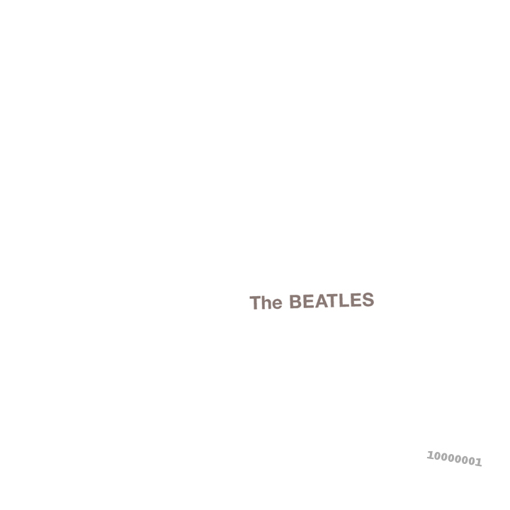
Nowadays - while the practicality of the cover being easy to read is still valued, the type design isn't going to make it stand out. It is very rare that you will find type design as masterfully simple as The Beatles' album cover, you're more likely to see such designs on an iPad box.
However, I value the importance of readability. I happen to really, really like iPad packaging. I happen to really, really like The Beatles' album cover. I want to include such daring typography in its simplicity with colour and style in my own design. That said - it still needs to find a way to represent my genre, but this will be done through imagery rather than type design.
1.) Capital letters and their bold consistency in height and width seems to be the direction most album covers go to make the text easier to notice and read.
2.) Sufficient space between each letter makes viewing feel less claustrophobic and uncomfortable.
3.) Contrasting text and background... but not too much!
My digipak design process
1. Capture images or create/edit images to my satisfaction in pixelmator on the school computers
2. Find an outline/ template for a digipak and try to match the images I am happy with to the digipak template. See what looks good and what works, and what to cut out and what to edit.
3. Once this is done, I will build my typography use so that it corresponds naturally to the other imagery on the digipak.
Sunday, 7 December 2014
Second music video draft
Joe- love it. Much clearer narrative, convincing and now the day of the dead look makes sense. Only comment would be is that there's a few parts where the motion shots are a bit repetitive, you had some beautiful stillness in the previous edit where she was in front of the mirror and looking out of the window. I might also remove the sound during the scene where she pushes the camera away from her? Just because it's not a dominant feature throughout and it doesn't really make sense in the context of the clip. It was a really good idea to introduce yourself as a character within the narrative and it then plays on the relationship between you two as a couple, but also there's that lovely synergy with the fact that your character is essentially singing to her and the lyrics have more meaning then. Awesome Joe, well done.
Typography on digipak covers part 1 genre
One of the most important aspects of design is type design and this is especially true for single and album covers, where the title (typography) is what takes most of the responsibility of how to identify the album.

Typography is used across hundreds of different formats - DVD covers, magazines, websites, applications, games and more. When researching typography, the most common (by far) factor in how the font is styled, was the genre. A horror film is more likely to use sharper, jagged and more violent looking font styles, usually with dark font colours (or if brighter colours, a darker background), with little space between characters to bring a claustrophobic feel. A romantic comedy is likely to use softer, more comfortable styles, with red or pink font colours.
Of course - as the years have passed and the genres have crossed - dozens of sub-genres are produced. With this, typography use has begun to stop following the rules all of the time. More styles of typography begin to be created to fit the ideas that are then associated with these sub-genres. Likewise, the type design for singles, albums and digipaks have also developed (as albums design philosophies are so similar to digipak's, I have researched them both.)
Lets take a look at the metal genre. Metal is a pretty heavy hitting genre of music. This - and its electronic influence, extends to create usually some quite bold and explosive designs of font for album and digipak covers. They also frequently tend to use violent or sad imagery on their covers - as this is sometimes consistent with the music and lyrics.

In the cover above, there is the bold electronic theme on both the band title (reminiscent of lightening) and the album title. This is also shown below for Iron Maiden - though the swing towards heavy rock - with often violent lyrics, have meant that the album title is styled to look a mixture of electronic but also blood. This shows development of typography across sub-genres, as Iron Maiden are arguably more extreme in their nature.


But (obviously...) metal isn't the only genre which has an influence from err, Electricity? Electro-pop is another genre in which we associate an electric feel with. Sure enough, there are some artists who feature this feel prominently in their font designs. Frankmusik and Kesha are just two of them.

Yet if you look at other popular artists - Ellie Goulding, Lady Gaga, Rihanna - any kind of electric heritage isn't there to be found. Things aren't black and white - just people something belongs to an electric sub-genre doesn't mean that the album cover should house electric inspired type design. Sometimes it's better to make the cover just look good. And hey - who really associates them with electricity anyway?

The album cover for XTC:Go 2, wonderfully simple yet effective idea
We now live in a world which has dozens of not hundreds of populated genres. That means dozens, if not hundreds of different tastes of music and audience segments. Genres need to produce designs for their album covers which target their particular audience - in this post, I will look at how typography helps them to do so, and how I might use the knowledge learned from this research in my ancillary task to produce a digipak cover.
Typography is used across hundreds of different formats - DVD covers, magazines, websites, applications, games and more. When researching typography, the most common (by far) factor in how the font is styled, was the genre. A horror film is more likely to use sharper, jagged and more violent looking font styles, usually with dark font colours (or if brighter colours, a darker background), with little space between characters to bring a claustrophobic feel. A romantic comedy is likely to use softer, more comfortable styles, with red or pink font colours.
Of course - as the years have passed and the genres have crossed - dozens of sub-genres are produced. With this, typography use has begun to stop following the rules all of the time. More styles of typography begin to be created to fit the ideas that are then associated with these sub-genres. Likewise, the type design for singles, albums and digipaks have also developed (as albums design philosophies are so similar to digipak's, I have researched them both.)
Lets take a look at the metal genre. Metal is a pretty heavy hitting genre of music. This - and its electronic influence, extends to create usually some quite bold and explosive designs of font for album and digipak covers. They also frequently tend to use violent or sad imagery on their covers - as this is sometimes consistent with the music and lyrics.
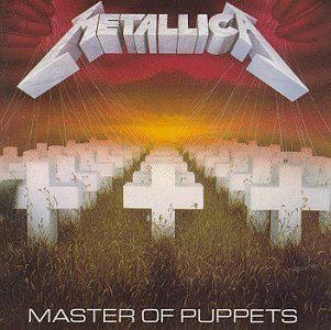
In the cover above, there is the bold electronic theme on both the band title (reminiscent of lightening) and the album title. This is also shown below for Iron Maiden - though the swing towards heavy rock - with often violent lyrics, have meant that the album title is styled to look a mixture of electronic but also blood. This shows development of typography across sub-genres, as Iron Maiden are arguably more extreme in their nature.

I know what you're thinking (not really), you can name quite a few metal bands which don't employ type designs inspired by electricity. Yeah, you're right. The things that started as unconventional begun to get more conventional - more and more violent lyrics, heavier chords, screamo... this all affects the type design and what type design we would associate with the genre until you end up with variety like this:
But (obviously...) metal isn't the only genre which has an influence from err, Electricity? Electro-pop is another genre in which we associate an electric feel with. Sure enough, there are some artists who feature this feel prominently in their font designs. Frankmusik and Kesha are just two of them.

Yet if you look at other popular artists - Ellie Goulding, Lady Gaga, Rihanna - any kind of electric heritage isn't there to be found. Things aren't black and white - just people something belongs to an electric sub-genre doesn't mean that the album cover should house electric inspired type design. Sometimes it's better to make the cover just look good. And hey - who really associates them with electricity anyway?

Now onto the main man - James Blake. It's difficult to coin James Blake into a genre - he's pretty unique. Dubstep when the ingredients are blended in a different order and different quantities. A truly electronic music producer. To some extent on his album cover, you can tell. But... not through the type design. I'm not going to copy James Blake - but I will draw inspiration from him as I should, as he is the artist behind my music video. He goes for a 'less is more' strategy - and from what I've researched I would agree when it comes to typography. He draws more from the image on the cover than from the type design to show genre. That being said, you couldn't mistake his type design for being the design for rock or metal... but you could for a lot of other genres.
From my research, I have seen that genres play a heavy role in determining what a font design looks like. However, this pattern doesn't necessarily extend across to every genre and sub-genre. Pop album covers and digipak covers don't really have any particular style and differentiating between them can be quite hard. That being said - a few patterns DID emerge.
1.) Genres which are happier or less extreme tend to have more simplistic type designs - the opposite is true for more extreme genres.
2.) Font colours contrast with their backgrounds pretty much always - to some extent.
3.) Across all genres - the text is usually either at the top or bottom of the cover, making plenty of space for imagery.
As I'm not going for one of the more extreme genres - in my final design I will use a more simplistic 'less is more' philosophy.
Friday, 5 December 2014
Editing update 3

Finally I have managed to capture all of the footage I need, and now all I need to do is find out how to use it in the most effective way. At this point, I have pretty much finished my production bar for a few changes here and there, and I also await feedback from my teacher. I added engaging scenes into the piece which allows for better identification with audiences through the theme of relationship problems, and the reasons for why exactly the character is so upset and depressed is now fairly clear. As you can see though - there are a lot of edits even towards the very end of the video. In my final edit, I wondered if I could find a way to settle down the atmosphere of the clip to match with the slowing pace of the music.
Again, clips with red thumbnails turn out to actually be functional in practice.
Tuesday, 2 December 2014
Ideas for amendments to music video production
I wanted to collect shots which showed the development of my female character into one who is 'depressed' or missing something important. I wanted to show the build up to why she is in her state because I felt it would add more interesting engagement to my piece.
I felt that while possible, there is limited effect of sticking to one central character in my actress for explaining the reasons why. It would also be fairly difficult to depict. I therefore wanted to add a new character to the mix - perhaps a love interest. I came up with the following ideas:
A love interest e.g. boyfriend, crush
A family member or close friend
A fatherly figure
I wanted to use one of these characters because it would justify the impact on my female character of becoming depressed or feeling a 'loss'. However - as the actress is only available on alternate weekends, I found difficulty in finding and arranging for another actor to play one of the roles listed above. I had to face the problem that I would have to play the new character if I wanted to make these changes. This meant that I decided to use the boyfriend character as it would be the most natural to act out.
To make matters worse, there was difficulty in finding a cameraman/woman who is willing to help in my production on such short notice. We would have to be creative in how we filmed footage. I came up with the following ideas:
Use a tripod. While reliable, I didn't particularly like the lack of movement especially in shots which I needed to be engaging and possibly fast paced
Use handheld camera shots. I would act as the cameraman but use the camera as some kind of 'selfie!' cam and film shots to give the impression of us recording our memories. This would allow me to film the good memories, and also the bad ones. I chose to use this one because
I also had to come up with ideas for what might happen to the relationship between the characters. I calmly decided that an argument would suffice, although I didn't reveal the reasons for the argument and so it can still be relate-able to a wide audience, and still contain its 'abstract' foundation.
Monday, 1 December 2014
First draft attempt at music video (unfinished)
Comments from teacher:
As it currently
Current overall grading of Production task (subject to moderation): 36/40
Joe- love the opening (0:00-1:00), beautifully shot, great cinematography in terms of tone, shot choice, creation of narrative and introduction to the character. At 1:50 you could cut to the girl in her bedroom looking out of the window or her looking in the mirror rather than her appearing in the forest, as she's just been in the house sitting on the stairs it might make more sense to use a house scene rather than cut outside? There would be more of a link there and then she can leave the house and you can have the forest scenes. I might use more scenes of her facing the camera or seeing the consequence of the character's feelings? I understand that she's alone, and half 'dead' essentially in terms of emotions etc, so what's the consequence of this for her?
In terms of an ending how're you ending the song? At the moment it just cuts out so can you pull some of the song together to create either a full stop ending or is it going to fade out?
Great job so far Joe."
While I feel the shots I have all look pretty good and professional, and that the idea that the girl is 'depressed' comes across well, I still find the video to be actually quite lacking in how engaging it is. Walking through the forest or looking out the window can't hold together a compelling video. I have decided I am going to film more shots, showing exactly why the girl feels like she does.
Monday, 20 October 2014
Editing update 2

Again, although the screenshot shows clips with thumbnails telling me that there are issues, they actually can be viewed fine, rendered and work well on the timeline. I have collected much more footage for use in the product and have gone a long way into implementing them into the product. I am much happier with the variety of clips I have to use. Despite this, there are still issues for the future of the music video past my current point. Again, there is lack of explanation or wide variety. Even though I have enough footage, I feel putting it in at this point wouldn't serve any purpose. I realised that once more I would need to capture hopefully one last set of clips, hopefully more exciting ones which serve to engage the audience into the character.
Sunday, 28 September 2014
Editing update 1

With footage captured, I decided to start editing together my music video. Although final cut declared that a lot of the video files needed to be connected, they actually worked perfectly when I added them to my timeline and was putting together the video. I didn't really get a lot done, but I laid the foundations for how my video would begin. One problem that plagued me was that I was beginning to notice just how long a three minute music video would be, and that I didn't really have that much variety to fit into those three minutes. I knew from this moment that more footage would need to be collected if I wanted the video to be engaging.
Something else which bothered me was rendering. Rendering took up most of my time when I was editing. If I wanted to complete my work on time I needed to try and get all of the 'big' changes out of the way first, so that rendering was minimal for the future.
Saturday, 27 September 2014
Production update 2
Today I was able to film the rest of my product (unless I decide I need more footage). I produced a variety of shots in the belmont/epsom downs area with my main actress Lily Picton.
I was happy with the quality of my shots and the connotations that could be drawn from them. Most were tracking shots, following her through the foresty area, and some were long shots taken with her walking up a hill and towards the camera and past it. Although not clear or obvious when filming or reviewing footage on the camera screen, it's possible that some shots might not have the same colour balance as others because it was significantly darker towards the end of the day than the start, but this isn't too worrying.
At the moment however, I'm beginning to worry about how little I have to work with on my editing. I feel as though I'll need to film quite a bit more footage of more exciting mise-en-scenes if I want my piece to be engaging.
Thursday, 25 September 2014
Production update 1
Yesterday I was able to film all of the shots that I wanted (unless I need to revisit) which take place in the house. The kitchen shots and bedroom shots are fully collected.
I faced some difficulties timewise - however. Towards the end of filming I was running out of good light to use, and had to use my house lights as I didn't have any equipment. This led to a very warm lighting set up which could be disappointing in my final product. I may have to remove saturation to instead use these shots as black and white shots.
Besides that, filming was productive and I felt that I got some very good shots to use in my product.
Tuesday, 23 September 2014
Main actress in music video
At the moment, my music video is to feature a single main character who will be played by 'Lily Picton March'.
I chose her to be my actress because she is willing to help with my production and even played an acting role within another one of her friend's media courseworks - so she has atleast a bit of experience with acting.
Another reason why I chose her to be my actress is because I feel she has the capability to display the conflictingly deep but also empty emotions that I'm looking for in my character. She is also very reliable at keeping to schedules and I can count on her to turn up.
Having a female character in my video could help female audiences to relate and identify with her character and my music video. However, I don't think that this necessarily will effect how male audiences view the video - it is still sung by a male and the music itself is the defining content while music videos are additional experiences.
Having already tested out make ups and costumes I'm extremely pleased with the overall look - edgy and jarring but still 'pretty' and photogenic - which can help in the overall aesthetic of the video.
Questionaire
After finding that I can't decide whether James Blake's audience is predominantly male or female based, I decided I am going to conduct a small questionaire on 50 of my friends (they will be in the sixth form all the way to ages thirty five, which I would say is most probably the target audience's age for James Blake's music). 25 of them will be male and the other 25 female. I will play extracts from two tracks 'Retrograde' and 'Limit To Your Love' (the good thing about doing this is that there is a lot of repetition in James Blake's songs, it doesn't appear to be much of a bad thing in his case but 30 seconds of his songs can often sum up the entire track). And simply ask 'Did you like this artist'. 50 people may not be significant enough to conclusively give an idea of which gender Blake's audience is preferred by, but it will do for purposes of my production. I will use a likert scale of:
I really like it - 5
I like it - 4
It's okay - 3
I don't like it - 2
I hate it - 1
and then consult my psychology teacher (who I know is experienced with statistical tests) or media teacher to analyse the data I collect.
If my results are particularly heavy in either direction, it could lead to me rethinking some ideas for my music video production.
Comparing James Blake's Retrograde video to Kieza's Hideaway video through Andrew Goodwin's theories part 1
James Blake's Retrograde video and Kieza's Hideaway are in some aspects pretty polar opposite. I thought it would be useful and insiteful to compare the two and how they fit (or don't fit) Andrew Goodwin's theories, and what different effects are drawn as a result.
1.) Characteristics from their music genres: Kieza's song is within the 'Deep House' genre - which is a mix of house music, jazz and soul. Her song is probably most akin to house - which is described as being 'electronic dance music' - this really is reflected in her video. It can therefore be said that her song fits into this aspect of Andrew Goodwin's theory. This works well because dancing provides entertaining visuals and it can be easily recognized by fans of the genre.
James Blake's genre however is a lot more misty. It's like an experimental version of dub-step, soul and R&B - and even then it is still difficult to define. In their own way, however - his videos seem to fit into the characteristics of the often slow and weird music. You could say it fits into Andrew Goodwin's theory - and it's good because the content of the videos is often just as ambiguous as the songs themselves. They stay interesting and give people the chance to take their own meanings from the text.
2 AND 3.) Illustrative, amplifying or contradicting visuals to the lyrics/ melody of the song: Other than the ecstasy-esque 'high' of Kiesza's 'Hideaway' (as shown below)
'Uh, you send me the shiver and the spine might overflow
You're bringing me closer to the edge, I'm letting go'
There isn't really any other similarities between the music video's content and the lyrics of the music. She dances down the street both solo and within groups in a euphoric manner - which you could say amounts to an 'amplifying' connection between the lyrics and the visuals of the video. This allows audiences to experience the same up-beat intensity across both the sound and the visuals - making that connection fluid and easy, as opposed to contradicting visuals which might require more effort to decipher and understand and which certainly wouldn't be as easy-watching.
James Blake on the other hand probably features a mix of illustrative and amplifying visuals. The video is just as odd as the song and you could take out different meanings from the visuals to go alongside different possible meanings of the lyrics. For example, 'You're alone now' - could be illustrated by how the woman in the video has a motorbike helmet on - cutting her off from everything else. When he sings 'Suddenly I'm hit' and the intensity in tempo and loudness of the music seems to rise, the screen flashes white and the imagery turns more extreme in the video.

Friday, 19 September 2014
Shooting schedule (UPDATED 10TH OCTOBER)
Shot
|
Location
|
Date
|
Bedroom shots – bed – position 1:
- - Medium-long shot
-
Medium shot
-
Medium-close shot
-
Close-up shot
-
Zoom from medium-long to close-up
-
Shaking camera shot
|
House, bedroom
|
20th September 2014 – 21st September 2014
|
Bedroom shots – bed – position 2:
-
Medium-long shot
-
Medium shot
-
Medium-close shot
-
Close-up shot
-
Zoom from medium-long to close-up
-
Shaking camera shot
|
House, bedroom
|
20th September 2014 – 21st September 2014
|
Bedroom shots – bed – position 3:
-
Interchanging by zooming between medium and
close up from the side of actress’s face.
|
House, bedroom
|
20th September 2014 – 21st September 2014
|
Bedroom shots – bed – position 4:
-
Interchanging by zooming between medium and
close up from the side of actress’s face
|
House, bedroom
|
20th September 2014 – 21st September 2014
|
Bedroom shots – bed – position 4 WITH MAKE UP
|
House, bedroom
|
20th September 2014 – 21st September 2014
|
Bedroom shots – bed – position 3 WITH MAKE UP
|
House, bedroom
|
20th September 2014 – 21st September 2014
|
Bedroom shots – bed – position 2 WITH MAKE UP
|
House, bedroom
|
20th September 2014 – 21st September 2014
|
Bedroom shots – bed – position 1 WITH MAKE UP
|
House, bedroom
|
20th September 2014 – 21st September 2014
|
Bedroom shots – by the window – position 1 WITH MAKE UP:
-
Medium close shot
-
Close shot
|
House, bedroom
|
20th September 2014 – 21st September 2014
|
Bedroom shots – looking into the mirror – position 1 WITH MAKE UP:
-
Medium close shot
|
House, bedroom
|
20th September 2014 – 21st September 2014
|
Kitchen shots – making tea:
-
Low angle medium shot
|
House, kitchen
|
20th September 2014 – 21st September 2014
|
Kitchen shots – sitting at table:
-
Medium-close shot
|
House, kitchen
|
20th September 2014 – 21st September 2014
|
Kitchen shots – sitting at table – black and white:
-
Medium-close shot
|
House, kitchen
|
20th September 2014 – 21st September 2014
|
Woods shots – Entering the forest and down the path:
-
Tracking shot 1 – varying between behind
actress and in front of actress, varying between long, medium and close
shots.
-
Tracking shot 2 – varying between behind
actress and in front of actress, varying between long, medium and close shots
(but at different places)
|
Belmont Downs wooded area
|
27th September 2014
|
Woods shots – Walking down the path:
-
Tracking shot 1 – behind the actress
-
Shaking camera shot – medium close up
-
Tracking shot 2 – in front of the actress
|
Belmont Downs wooded area
|
27th September 2014
|
Woods shots – Walking up the hill:
-
Tracking shot 1 – behind the actress medium to
medium close shots
-
Tracking shot 2 – in front of the actress
medium to close shots
-
Long shot 1 – behind the actress low angle
-
Long shot 2 – In front of actress high angle
|
Belmont Downs wooded area
|
27th September 2014
|
Woods shots – the same shots all around – WITH MAKE UP
|
Belmont Downs wooded area
|
27th September 2014
|
Bedroom shots – off the bed and out of the room:
-
Shot 1 panning medium shot
-
Shot 2 panning medium shot (different
position)
-
Shot 3 medium close shot – putting on coat
-
Shot 4 Medium close tracking shot (from the
side).
|
House, bedroom
|
18th October 2014
|
Bathroom shots:
-
Shot 1 low angle medium shot
-
Shot 2 low angle medium close mirror shot
-
Shot 3 low angle viewing sink
|
House, bathroom
|
18th October 2014
|
Door shots:
-
Shot 1 high angle long shot putting on shoes
-
Shot 2 tracking behind actress out of the door
-
Shot 3 tracking in front of actress out of the
door
|
House, downstairs door hallway
|
18th October 2014
|
Pavement/street walk shots:
-
Shot 1 tracking shot behind actress
-
Shot 2 tracking shot in front of actress
|
Street – pavement walk
|
18th October 2014
|
Grassland shot – Medium close to close up shot
|
Overton Grange park
|
18th October 2014
|
Subscribe to:
Posts (Atom)