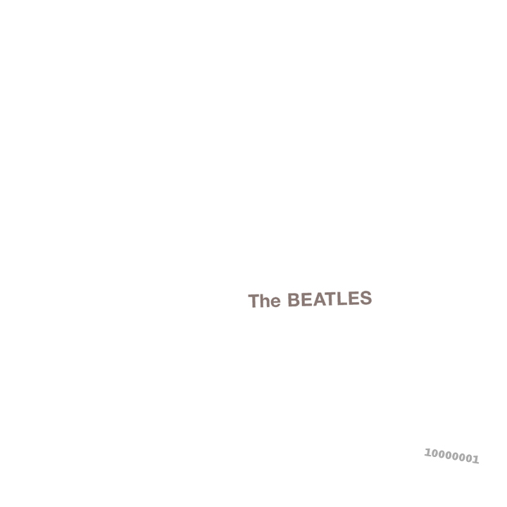
For the time, this design is striking due to its simplicity. There is no imagery to clutter the design and no bold colours to distract or strain the eyes, which would have been a daring and radical design for the 1960s.
The colour style here is actually quite similar to Apple and Google's use of colours in fonts - often opting for a medium grey text colour and white background. It's an effective idea which serves to make the text easy to read yet not contrasting enough to to strain your eyes. It shows that one of the most important jobs in typography is in using designs which are easy to read and understand. I will show the importance of this below.

You don't have to guess which design would keep you engaged longer. The heavy contrast of the green and orange design is plainly uncomfortable to read, while the more subtle contrast of grey against white is far easier to read.
Nowadays - while the practicality of the cover being easy to read is still valued, the type design isn't going to make it stand out. It is very rare that you will find type design as masterfully simple as The Beatles' album cover, you're more likely to see such designs on an iPad box.
However, I value the importance of readability. I happen to really, really like iPad packaging. I happen to really, really like The Beatles' album cover. I want to include such daring typography in its simplicity with colour and style in my own design. That said - it still needs to find a way to represent my genre, but this will be done through imagery rather than type design.
1.) Capital letters and their bold consistency in height and width seems to be the direction most album covers go to make the text easier to notice and read.
2.) Sufficient space between each letter makes viewing feel less claustrophobic and uncomfortable.
3.) Contrasting text and background... but not too much!
No comments:
Post a Comment