
The album cover for XTC:Go 2, wonderfully simple yet effective idea
We now live in a world which has dozens of not hundreds of populated genres. That means dozens, if not hundreds of different tastes of music and audience segments. Genres need to produce designs for their album covers which target their particular audience - in this post, I will look at how typography helps them to do so, and how I might use the knowledge learned from this research in my ancillary task to produce a digipak cover.
Typography is used across hundreds of different formats - DVD covers, magazines, websites, applications, games and more. When researching typography, the most common (by far) factor in how the font is styled, was the genre. A horror film is more likely to use sharper, jagged and more violent looking font styles, usually with dark font colours (or if brighter colours, a darker background), with little space between characters to bring a claustrophobic feel. A romantic comedy is likely to use softer, more comfortable styles, with red or pink font colours.
Of course - as the years have passed and the genres have crossed - dozens of sub-genres are produced. With this, typography use has begun to stop following the rules all of the time. More styles of typography begin to be created to fit the ideas that are then associated with these sub-genres. Likewise, the type design for singles, albums and digipaks have also developed (as albums design philosophies are so similar to digipak's, I have researched them both.)
Lets take a look at the metal genre. Metal is a pretty heavy hitting genre of music. This - and its electronic influence, extends to create usually some quite bold and explosive designs of font for album and digipak covers. They also frequently tend to use violent or sad imagery on their covers - as this is sometimes consistent with the music and lyrics.
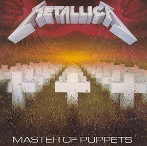
In the cover above, there is the bold electronic theme on both the band title (reminiscent of lightening) and the album title. This is also shown below for Iron Maiden - though the swing towards heavy rock - with often violent lyrics, have meant that the album title is styled to look a mixture of electronic but also blood. This shows development of typography across sub-genres, as Iron Maiden are arguably more extreme in their nature.

I know what you're thinking (not really), you can name quite a few metal bands which don't employ type designs inspired by electricity. Yeah, you're right. The things that started as unconventional begun to get more conventional - more and more violent lyrics, heavier chords, screamo... this all affects the type design and what type design we would associate with the genre until you end up with variety like this:

But (obviously...) metal isn't the only genre which has an influence from err, Electricity? Electro-pop is another genre in which we associate an electric feel with. Sure enough, there are some artists who feature this feel prominently in their font designs. Frankmusik and Kesha are just two of them.

Yet if you look at other popular artists - Ellie Goulding, Lady Gaga, Rihanna - any kind of electric heritage isn't there to be found. Things aren't black and white - just people something belongs to an electric sub-genre doesn't mean that the album cover should house electric inspired type design. Sometimes it's better to make the cover just look good. And hey - who really associates them with electricity anyway?

Now onto the main man - James Blake. It's difficult to coin James Blake into a genre - he's pretty unique. Dubstep when the ingredients are blended in a different order and different quantities. A truly electronic music producer. To some extent on his album cover, you can tell. But... not through the type design. I'm not going to copy James Blake - but I will draw inspiration from him as I should, as he is the artist behind my music video. He goes for a 'less is more' strategy - and from what I've researched I would agree when it comes to typography. He draws more from the image on the cover than from the type design to show genre. That being said, you couldn't mistake his type design for being the design for rock or metal... but you could for a lot of other genres.
From my research, I have seen that genres play a heavy role in determining what a font design looks like. However, this pattern doesn't necessarily extend across to every genre and sub-genre. Pop album covers and digipak covers don't really have any particular style and differentiating between them can be quite hard. That being said - a few patterns DID emerge.
1.) Genres which are happier or less extreme tend to have more simplistic type designs - the opposite is true for more extreme genres.
2.) Font colours contrast with their backgrounds pretty much always - to some extent.
3.) Across all genres - the text is usually either at the top or bottom of the cover, making plenty of space for imagery.
As I'm not going for one of the more extreme genres - in my final design I will use a more simplistic 'less is more' philosophy.
No comments:
Post a Comment