Of course I was never going to use paint.
But with my step-father having all of adobe's design software, it was worth making use of. At first, I was going to near replicate what I already had, below:

But I would give a go at using InDesign to just basically fool around. See what I could muster up and if I could improve what I already had.
One of my earlier ventures in the new design software:

By this point, I had discovered that James Blake's first album was actually called 'James Blake'. With this discovery and my love for simplistic and minimalistic design, I wanted to take advantage and do the same with my own digipak design, and use just 'James Blake' as the only text on the front cover.
I used quite a sharp and slender type for 'James Blake' because it is consistent with a skeletal figure, which is a form of imagery used on Lily Picton's face throughout my music video. It denotes some sense of eeriness which is definitely felt when listening to Blake's music, so it also fits his genre too.
The grey header with darker grey text allows for a simplistic typography design which is easily read thanks to a strong contrast which isn't quite strong enough to strain the eyes.
I was still going to add in the effect of a blurred, cross faded face - like in my previous designs and James Blakes actual cover. But when I tried to find a way to get this effect, I deleted the image of Lily's face by accident.
Best. Accident. Ever.
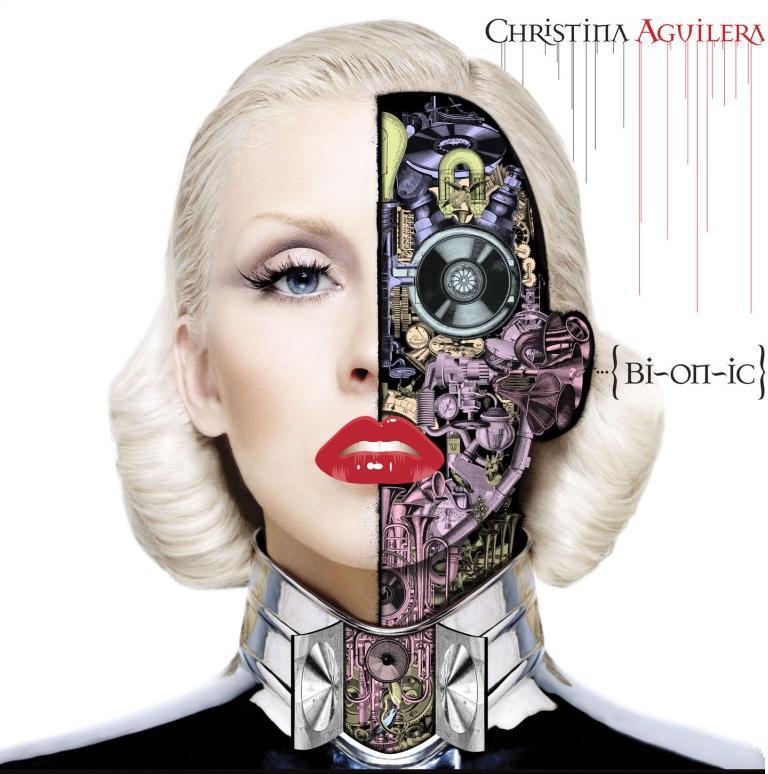
I was left with a plain creamy grey background - and my minimalist senses were tingling. One of the things I had picked up on when doing research was the quite lovely effect of extended lines coming down from text to give the effect of a 'drip'. I realised that this was from looking at Aguilera's cover:
When I was left with the blank canvas and 'James Blake', this was something I wanted to play around with. I came up with this design

Which I thought was minimal, simple, and effective. It keeps with the eerie skeletal-like theme of the typography while introducing a new effect, as if it is melting - degrading into a puddle. This could give across the connotation of feeling as though you are degrading becoming something... less. This is a theme sure to be found in many of his songs, most notibly 'Retrograde. The rest of the cover being blank could denote well - emptiness.
But it didn't link to my music video much anymore, and the grey and more grey colour scheme and imagery didn't give a lot to base the rest of my design around. I talk about consistency being important - being consistent with this could be, well, too boring.
I added in a bit - not too much, to give a little more flavour.

I found a way to feature my photograph of Lily in the front cover in a pretty stripped down way. I chose to use the blurred greenery in the background of the photograph and use it as my puddle. It means the rest of my product is able to use more colourful imagery, whereas before it would have looked a little boring if it was anything but grey and darker grey. It also relates my cover to my music video in a very slight way - making it a more effective marketing tool.
Done.
No comments:
Post a Comment