This is because while still important, typography/ type design is most of the time a second consideration after the rest of the design (although badly designed typography could ruin a cover). The text isn't usually the first thing people see, or a particularly marketable element when compared to the imagery on the cover.
Due to all of the different genres out there as well as artists desperately wanting to stand out, there are thousands of possibilities for digipak cover imagery.
Just take a look at David Bowie - a major figure in world music for over four decades. His digipak cover is below - an assortment of abstract images and blotches of colour, and a much younger and cartoon-like re imagining of Bowie himself.

From using media analysis but having not listened to the album myself, I would guess that the contrast of the name of the album 'reality' to the abstract representations on the cover either suggests a rejection of reality in favour of a hyper-reality world, or an accepting of reality and discarding of unrealistic ideas and thoughts. I lean towards the former.
But someone who doesn't particularly care about the connotations of a digipak cover is more interested in whether the product looks good or not. While subjective to some extent, most would agree that the bright and bold colours of Bowie's digipak cover is successful in drawing good attention.
So, sometimes your digipak cover can have meanings - but this doesn't mean much if the cover doesn't look great too. With that said - here are some of the biggest points I have learned when researching digipak imagery:
1.) Research your brand and keep relatively consistent to it:
James Blake is an artist who deals with electric pop and house music - but he goes about it in a very unconventional way. This allows me to have a lot of creative freedom in what I put in my cover, but not too much. It still wouldn't make sense if I pushed a death metal style cover in.
Instead, stay consistent to a slow, thoughtful and somewhat understated design that is used in a lot of James Blake's work. He uses a lot of dark colours in his work - so it makes sense to use darker colours than David Bowie, for example, who's dynamic range of music and style allows him to use just about any colours he wants.
You can see James Blake's brand of music philosophy in his own album cover below:

Firstly, muted, dark colours are used. And a colder, blue theme is preferred over a reddish one. This stays consistent with the slow and dark nature of his music.
2.) If you want something to stand out, big doesn't always work.
Sure, making something large can draw attention to it, but it's not always the best way. One thing that is encouraged in digital design is the use of space and contrast over size. If you leave a lot of empty space around a particular item, it stands out. If you use particular contrast, it helps the contrasting item to stand out.
3.) Digipak covers very often use a mixture of abstract and real imagery.
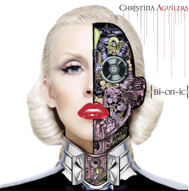
In a world where a large majority in most cultures own a pocketable camera in the form of phones, and globalisation through social media and the internet has led to the sharing of fantastic photography across all corners of the population. As a result, it perhaps becomes more difficult to create photographs which show something new and interesting to audiences in the small format of a digipak cover. I theorise that this leads to artists combining abstract imagery with realistic imagery to create more interesting covers. You can see this at work in James Blake's album cover, as well as Christina Aguilera's cover below.

If the image consisted of only Aguilera's real face, it wouldn't really be interesting enough to engage audiences beyond Aguilera's brand name. The abstract bionic imagery adds a new dimension to the piece, making it more enticing and proposing a deeper message - perhaps the album has an electronic style? Maybe it's a comment on society?
Conclusion:
You could argue about what is most important when it comes to designing cover art. Is it the message of the album? Is it pure aesthetics? A representation of the album's style? I like to think that they are - most of the time, considered of equal importance. I would say that the process is first: How do we represent the style of the music on our cover. Second: How can we make a possible message out of the elements that we've picked up on so far? And lastly: How can we make this work aesthetically.
Due to all of the different genres out there as well as artists desperately wanting to stand out, there are thousands of possibilities for digipak cover imagery.
Just take a look at David Bowie - a major figure in world music for over four decades. His digipak cover is below - an assortment of abstract images and blotches of colour, and a much younger and cartoon-like re imagining of Bowie himself.

From using media analysis but having not listened to the album myself, I would guess that the contrast of the name of the album 'reality' to the abstract representations on the cover either suggests a rejection of reality in favour of a hyper-reality world, or an accepting of reality and discarding of unrealistic ideas and thoughts. I lean towards the former.
But someone who doesn't particularly care about the connotations of a digipak cover is more interested in whether the product looks good or not. While subjective to some extent, most would agree that the bright and bold colours of Bowie's digipak cover is successful in drawing good attention.
So, sometimes your digipak cover can have meanings - but this doesn't mean much if the cover doesn't look great too. With that said - here are some of the biggest points I have learned when researching digipak imagery:
1.) Research your brand and keep relatively consistent to it:
James Blake is an artist who deals with electric pop and house music - but he goes about it in a very unconventional way. This allows me to have a lot of creative freedom in what I put in my cover, but not too much. It still wouldn't make sense if I pushed a death metal style cover in.
Instead, stay consistent to a slow, thoughtful and somewhat understated design that is used in a lot of James Blake's work. He uses a lot of dark colours in his work - so it makes sense to use darker colours than David Bowie, for example, who's dynamic range of music and style allows him to use just about any colours he wants.
You can see James Blake's brand of music philosophy in his own album cover below:
Firstly, muted, dark colours are used. And a colder, blue theme is preferred over a reddish one. This stays consistent with the slow and dark nature of his music.
2.) If you want something to stand out, big doesn't always work.
Sure, making something large can draw attention to it, but it's not always the best way. One thing that is encouraged in digital design is the use of space and contrast over size. If you leave a lot of empty space around a particular item, it stands out. If you use particular contrast, it helps the contrasting item to stand out.
3.) Digipak covers very often use a mixture of abstract and real imagery.
In a world where a large majority in most cultures own a pocketable camera in the form of phones, and globalisation through social media and the internet has led to the sharing of fantastic photography across all corners of the population. As a result, it perhaps becomes more difficult to create photographs which show something new and interesting to audiences in the small format of a digipak cover. I theorise that this leads to artists combining abstract imagery with realistic imagery to create more interesting covers. You can see this at work in James Blake's album cover, as well as Christina Aguilera's cover below.
If the image consisted of only Aguilera's real face, it wouldn't really be interesting enough to engage audiences beyond Aguilera's brand name. The abstract bionic imagery adds a new dimension to the piece, making it more enticing and proposing a deeper message - perhaps the album has an electronic style? Maybe it's a comment on society?
Conclusion:
You could argue about what is most important when it comes to designing cover art. Is it the message of the album? Is it pure aesthetics? A representation of the album's style? I like to think that they are - most of the time, considered of equal importance. I would say that the process is first: How do we represent the style of the music on our cover. Second: How can we make a possible message out of the elements that we've picked up on so far? And lastly: How can we make this work aesthetically.
No comments:
Post a Comment